
Office branding can go wrong very quickly.
Too many slogans, too much colour, graphics with no connection to the actual space, and suddenly the office feels forced rather than considered. In real workspaces, the branding ideas that tend to work best are usually the ones that are integrated into the environment through glass, walls, signage and surfaces, rather than simply added for the sake of it.
Done well, office branding can do a lot more than display a logo. It can shape first impressions, reinforce brand identity, make a tired office feel more premium and bring more consistency to the overall workspace. It can also help visitors, staff and clients understand the tone of the business the moment they walk through the door.
The key is choosing branding ideas that suit the company, the layout and the way the office is actually used. What works in a bold creative workspace may feel completely wrong in a more polished, client-facing environment. That is why the best office branding is rarely the loudest. More often, it is the branding that feels intentional, well-placed and right for the space.
In this guide, we will look at the office branding ideas that actually work in real offices, including reception areas, glazed partitions, meeting rooms, walls, doors and signage, along with how to choose the right approach for your workspace.
In This Guide
What Makes a Good Office Branding Idea in Practice?
A good office branding idea should do more than fill a blank wall.
In practice, the strongest office branding usually helps the space feel more consistent, more recognisable and more aligned with the business. It should support first impressions, reflect the tone of the company and feel like it belongs in the workspace rather than being applied as an afterthought.
That is where a lot of office branding schemes go wrong. Businesses sometimes focus too heavily on the idea of “adding branding” without thinking enough about how that branding will sit within the office itself. A space can have branded graphics everywhere and still feel disjointed if those elements do not relate to the architecture, layout, finishes or day-to-day function of the workplace.
In real workspaces, the most effective branding is usually integrated into glass, surfaces and signage rather than plastered across every wall. A frosted meeting room graphic, a clean reception sign, subtle zoning elements or a well-considered wall graphic will often do more for the space than a loud collection of slogans and oversized visuals.
Good office branding should also suit the type of company it represents. A vibrant, high-energy brand may naturally support bolder graphics and stronger colour use. A consultancy or professional office, on the other hand, may benefit far more from a subtle, premium approach that uses privacy film, understated signage, muted graphics and carefully selected finishes.
The best office branding ideas tend to share a few things in common:
- they reinforce the brand without overwhelming the space
- they improve perception and first impressions
- they work with the layout of the office rather than against it
- they often combine appearance with function
- they make the workspace feel more intentional and complete
That last point matters more than people often realise. In many offices, branding is not just about visibility. It is about making the whole environment feel more considered.
The Best Office Branding Ideas by Area
The most effective office branding ideas are usually not all concentrated in one place. They are spread through the workspace in a way that feels joined-up and appropriate to each area.
Rather than thinking about branding as one big feature, it usually makes more sense to look at it by location. Reception areas, glazed partitions, office walls and smaller touchpoints all do slightly different jobs, so the best solution for each one is often different too.
Reception Branding Ideas
Reception is often where office branding has the most immediate impact.
It is the first area visitors, clients and candidates see, so it carries a lot of weight in shaping how the business is perceived. Even relatively simple branding in this part of the office can make the workspace feel more established, more professional and more intentional.
Some of the most effective reception branding ideas include acrylic logo signs, cut vinyl logos, clean wall-mounted branding, subtle feature graphics and branded reception desk fronts. These tend to work well because they give the space a clear identity without making it feel overdesigned.
For some businesses, a simple logo sign and refined colour palette are enough. For others, the reception area may benefit from a larger visual statement, especially if the brand is more expressive or the business wants a stronger front-of-house presence. The important thing is that the branding fits the tone of the company and the quality of the space.
This is also one of the easiest areas to get wrong. A reception area can quickly feel dated or heavy-handed if the branding is too loud, too large or disconnected from the rest of the workplace. In many cases, a more restrained approach feels stronger and more premium.
If the goal is to create a good first impression, reception branding should not just be visible. It should feel considered.
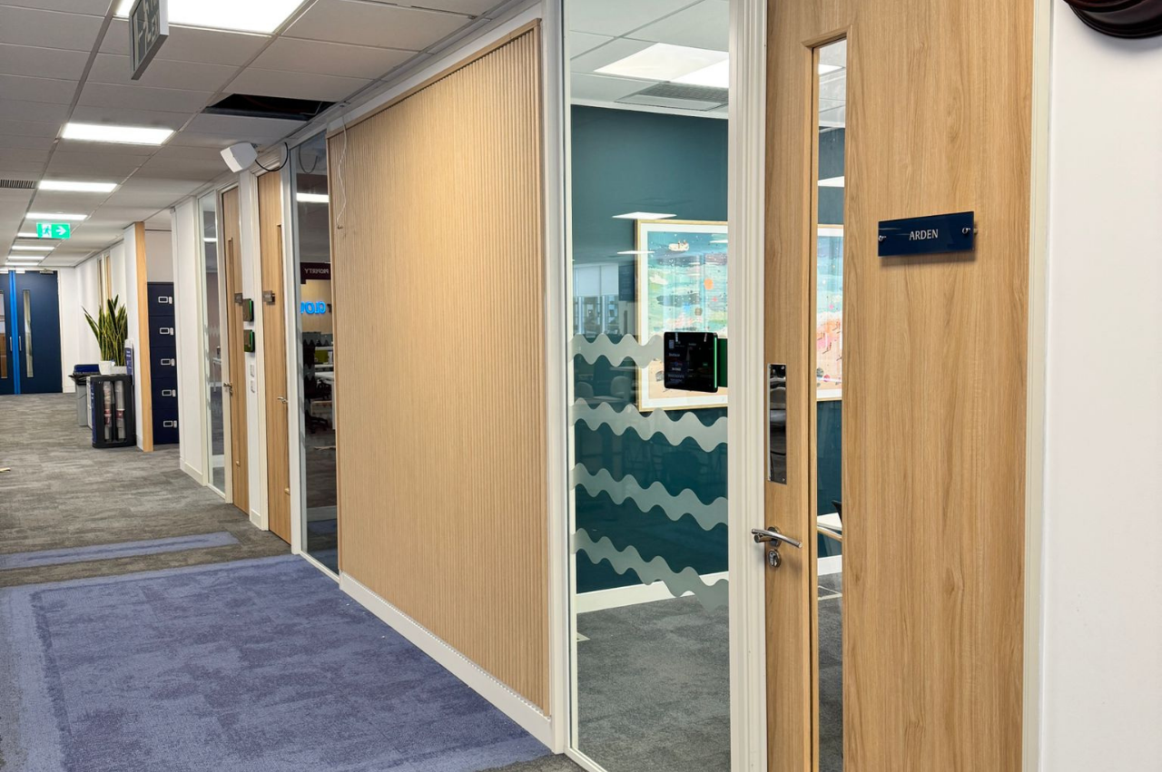
Branding Ideas for Office Glass and Glazed Partitions
Glass is one of the best places to introduce office branding because it can combine identity, privacy and function in one element.
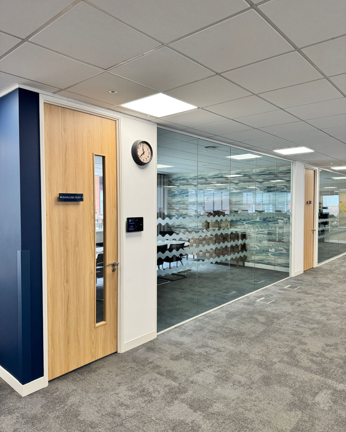
In many offices, glazed partitions and meeting room screens offer a strong opportunity to add branding without making the space feel visually cluttered. Frosted film, manifestation graphics, cut vinyl logos and room names can all help define areas of the office while reinforcing the wider brand.
This is especially effective in meeting rooms, corridors and internal glazed partitions, where branding can do more than one job at once. A branded manifestation design, for example, can improve safety and visibility while also helping the office feel more tailored to the business. Frosted or partially frosted film can add privacy where needed, while still keeping the space feeling bright and open.
For businesses that want a softer, more design-led look, reeded effect film can also work well. It creates a more subtle, premium finish than standard frosted graphics and can suit offices where the overall feel needs to be polished rather than bold.
The strongest office glass branding ideas are usually the ones that feel integrated into the architecture of the workspace. They do not just sit on the glass. They help the glass become part of the branded environment.
This is one reason glass branding often works better than people expect. It can carry identity in a way that feels refined, practical and less visually heavy than trying to rely entirely on large wall graphics.
Office Wall Branding Ideas
Walls can carry some of the most visually striking office branding, but that does not mean every wall needs it.
The best office wall branding ideas are usually selective. A well-placed large-format graphic, feature wall, zoning element or branded visual can transform how a workspace feels, but too much wall branding can have the opposite effect and make the office feel cluttered or overworked.
This is where context matters. Some offices suit bold graphics and larger visual gestures, especially when the branding is part of a broader interior scheme. Others benefit more from a restrained approach, where one or two key areas carry the branding and the rest of the workspace stays calmer and more functional.
Large-format print can work especially well where a business wants to bring identity, energy or visual consistency into a workplace. It is often effective in circulation areas, breakout spaces, collaboration zones or along feature walls where there is enough room for the design to breathe.
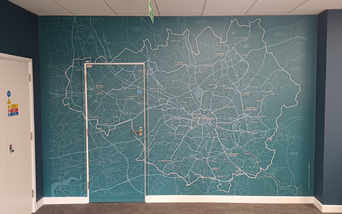
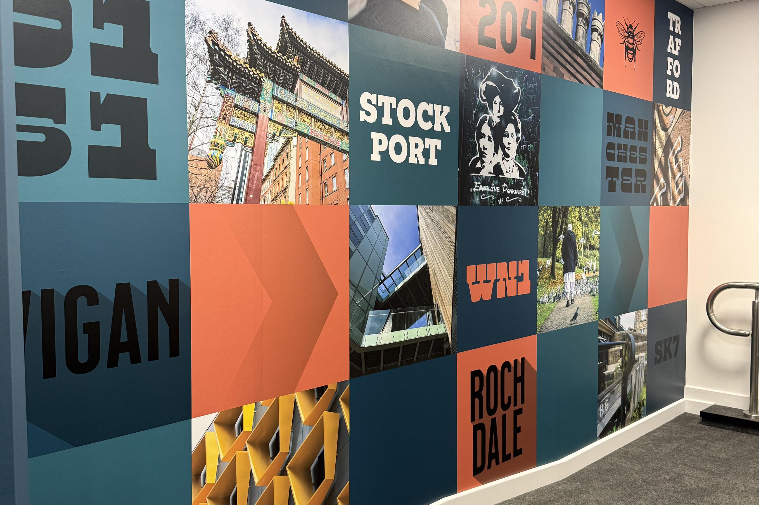
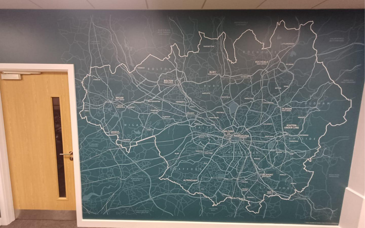
On one recent office project in Manchester, we installed around 150sqm of large-format printed wall graphics as part of a wider branding scheme. The project also included zoning cut vinyl text, desk and locker stickers, vinyl signage, acrylic signage and meeting room signage. What made the scheme work was not just the amount of graphics involved, but how those branded elements were spread through the space. Rather than relying on one oversized branding statement, the office used multiple touchpoints to create a more joined-up and recognisable environment.
That is often the difference between office wall branding that works and wall branding that feels forced. The strongest schemes usually relate to the wider space. They support how the office is used, help define areas and reinforce the brand in a way that feels connected rather than random.
Wall graphics can be very effective, but they tend to work best when they are part of an overall approach rather than treated as the entire branding strategy.
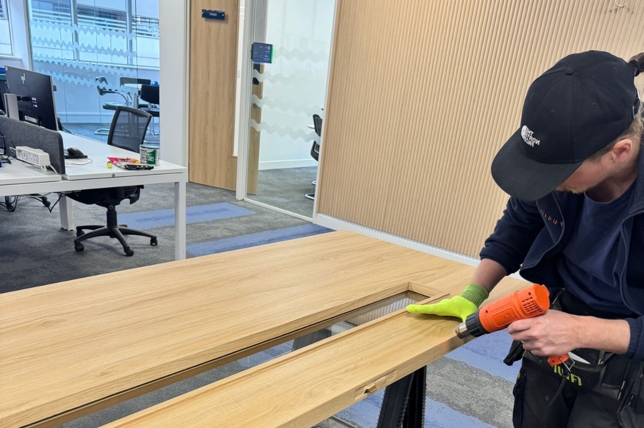
Office Door Branding and Wrapped Surface Ideas
Office branding is not always about graphics.
In many workplaces, some of the most effective branding comes from the way surfaces look and feel rather than from printed messaging. Doors, built-in joinery, counters and other fixed elements can all contribute to the overall impression of the space, especially when older finishes are making the office feel tired or inconsistent.
This is where vinyl wrapping can work particularly well. Wrapping office doors or other surfaces can help bring a stronger sense of consistency into the workspace without the cost and disruption of full replacement. In some cases, this may be less about adding obvious branding and more about making the office feel more polished, more intentional and more in line with the wider brand.
That matters because branding is not just about what carries a logo. It is also about what the space communicates overall. A tired office with worn finishes can undermine the impression a business is trying to create, even if the walls display the correct colours and messaging. Upgrading those surfaces can make a workplace feel more premium and more aligned with the brand without needing to rebuild it.
We have seen this with projects such as Warner Hotels Head Office Door Wrapping, where improving the finish and consistency of key surfaces helped strengthen the overall feel of the environment. It is a good example of how office branding can come through material quality and surface condition, not just through printed graphics.
This kind of approach often works especially well in offices that want branding to feel subtle. Rather than filling the workspace with visual statements, the office feels more cohesive because the finishes are doing part of the work.
Branding Ideas for Desks, Lockers and Smaller Touchpoints
The smaller details in an office rarely carry the whole branding scheme, but they can make a big difference to how complete it feels.
Desk graphics, locker stickers, department markers and other small branded elements tend to work best when they support a wider office branding approach. On their own, they are usually not the main feature. Used properly, though, they help create consistency across the workspace and make the environment feel more joined-up.
This is particularly useful in larger offices where branding needs to travel through multiple areas rather than sit in just one or two feature zones. A workspace can feel far more considered when those smaller touchpoints reflect the same visual language as the glass graphics, wall branding and signage elsewhere in the building.
The key is restraint. Smaller branding details should help tie the space together, not add clutter. When they are too busy or overused, they can start to feel gimmicky. When they are handled well, they help the office feel more intentional without demanding attention.
That is often what makes these smaller branding ideas effective. They are not trying to dominate the workspace. They are reinforcing it.
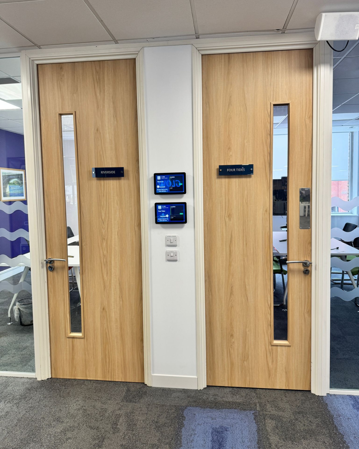
Office Signage and Wayfinding Ideas
Signage is one of the most practical forms of office branding because it can support the way a space works while also reinforcing identity.
Room names, directional graphics, acrylic signs, cut vinyl markers and branded wayfinding elements can all help a workspace feel more organised and more coherent. They can also make a strong contribution to first impressions, especially in larger offices where visitors need to navigate the building or understand the layout quickly.
Good office signage should feel like part of the interior, not an afterthought. That means thinking about scale, placement, materials and finish, as well as the visual identity itself. A well-designed sign system can make an office feel far more polished, even when the branding is fairly understated.
This is also an area where subtle branding often works better than loud branding. Clear, well-made signage tends to carry more authority than signage that tries too hard to make a visual statement. In many offices, the goal is not to turn every sign into a feature. It is to make the whole system feel clean, consistent and in keeping with the brand.
Where signage is combined with graphics, film and surface upgrades, the result is usually much stronger than relying on one branding element alone. It becomes part of the overall language of the space.
Where Office Window Film Makes the Biggest Difference
Some office branding ideas are more consistently effective than others.
In real workspaces, the strongest results usually come from branding elements that combine visual identity with function and fit naturally into the office environment. Rather than trying to force branding into every available area, it is usually more effective to focus on the places where it will have the most impact.
The office branding ideas that tend to work best include:
- Reception branding that creates a clear first impression through logo signage, desk branding or a well-placed feature wall
- Branded manifestation and privacy film that adds identity to glazed partitions while also supporting privacy and safety
- Large-format wall graphics used selectively in the right areas rather than across every wall
- Meeting room graphics and naming that make spaces feel more tailored and easier to navigate
- Door wrapping and surface upgrades that improve consistency and give the workspace a more premium overall feel
- Wayfinding and branded signage that support the office practically while reinforcing the wider identity
- Smaller branded touchpoints such as locker stickers, desk graphics and zoning details that help tie everything together
What these options have in common is that they do not rely on branding for branding’s sake. They work because they help the office feel more intentional, more consistent and more aligned with the business.
Office Branding Ideas That Often Go Wrong
Office branding usually starts to feel weak when it is driven by visibility alone.
One of the most common mistakes is overdoing slogans. A message that looks good in a presentation can feel forced once it is spread across multiple walls in a real office. That tends to make the workspace feel more like a themed environment than a professional interior.
Another issue is graphics that have no real connection to the actual space. Branding works best when it reflects the architecture, layout and tone of the workplace. If the design could be lifted out and dropped into any random office, it often ends up feeling generic, even if the visuals themselves are attractive.
Branding that is too loud for the business can also be a problem. What feels right for a vibrant creative brand may feel completely wrong in a professional, polished or client-facing office. The branding should reflect the company, not just current design trends.
Trying to make every wall work hard is another common mistake. Not every surface needs to carry a message or visual. In many cases, the strongest branding is the branding that knows when to stop.
Office branding also tends to suffer when function is ignored. Glass graphics, signage and zoning elements should not just look good. They should make sense within the way the office operates. When branding supports privacy, navigation, layout and perception all at once, it usually feels far more successful.
How to Choose the Right Office Branding Approach for Your Workspace
The right office branding approach depends on more than just what looks good on paper.
It should reflect the type of business, the way the office is used and the impression the company wants to create. A client-facing professional office may need something subtle and premium, while a more expressive brand may be able to carry bolder graphics and stronger visual contrast.
A useful starting point is to think about what the office actually needs to do. Is the priority to create a better first impression? Reinforce brand identity for visitors and staff? Improve privacy in meeting rooms? Make a tired office feel more polished? Or bring consistency across a workspace that currently feels disjointed?
The answers to those questions usually point towards the right mix of elements.
For example:
- if first impressions matter most, reception branding and signage may carry the most value
- if the office feels too open or lacks definition, branded privacy film and meeting room graphics may be the better focus
- if the problem is that the workspace feels dated, wrapped surfaces and upgraded finishes may make the biggest difference
- if the office feels inconsistent, a combination of wall graphics, signage and smaller branded details may be the best route
In most cases, the right solution is not one single feature. It is a combination of elements used in the right places and to the right extent.
How Much Does Office Branding Cost?
The cost of office branding depends entirely on the scope of the project.
A simple cut vinyl logo applied in one area will naturally cost less than a wider scheme involving large-format printed graphics, meeting room film, acrylic signage and multiple branded touchpoints across the office. The type of materials being used, the number of areas involved and the complexity of the installation all influence the final cost.
Design input can also make a difference. There is a clear difference between a project where the client provides print-ready artwork and one where the branding concepts, layouts and graphics are being developed from scratch. The more design work involved at the front end, the more that needs to be factored into the cost.
The choice between cut vinyl and full printed graphics also affects pricing. In general, a simple cut vinyl logo or text element will be more cost-effective than a large printed feature graphic, particularly where multiple colours, imagery or more detailed design work are involved.
Installation conditions matter too. A straightforward install in an accessible office area is different from a phased project in a live working environment where access needs to be managed carefully around staff, visitors or working hours.
So while there is no single price for office branding, the most useful way to think about cost is in terms of scope, material choice, design input and the number of areas being addressed. In many cases, branding can still make a noticeable impact without requiring a full refurbishment budget.
Real Examples of Office Branding in Practice
The easiest way to understand what works is to look at how branding performs in real office environments.
Manchester Office Branding Project
On one recent office project in Manchester, we delivered a wide-ranging branding scheme across the workspace, including around 150sqm of large-format printed wall graphics, zoning cut vinyl text, desk and locker stickers, vinyl signage, acrylic signage and meeting room signage.
What made this project effective was not just the amount of branded material used, but how it was distributed through the office. Rather than relying on one large visual statement, the branding was layered through different areas of the workspace, helping the office feel more joined-up and recognisable without becoming visually overwhelming.
It was a good example of how office branding tends to work best in practice. Not as one feature, but as a system of connected elements across walls, signage, furniture and shared spaces.
Warner Hotels Head Office Door Wrapping
Warner Hotels Head Office is another useful example, even though it sits slightly differently within the branding conversation.
This project shows that office branding is not always about adding obvious graphics. Sometimes it is about improving the consistency and finish of the environment so the space feels more aligned with the business. Upgrading doors through wrapping helped create a more polished and intentional look, which in turn supports the wider perception of the workspace.
That is an important point in real office branding projects. The workplace does not always need more graphics. Sometimes it needs better surfaces, stronger consistency and a more considered finish.
FAQs About Office Branding Ideas
What are the best office branding ideas?
The best office branding ideas are usually the ones that feel integrated into the workspace rather than simply added to it. In practice, that often means reception signage, branded manifestation or privacy film, large-format wall graphics, meeting room graphics, subtle wayfinding and, in some cases, wrapped doors or surfaces that help the office feel more consistent overall.
What works best will depend on the type of business and the tone the space needs to create. A more expressive company may suit bolder graphics, while a more polished or client-facing office may benefit from a more subtle, premium approach.
How can I brand an office without a full refurbishment?
Office branding does not have to mean stripping everything out and starting again. In many cases, branding can be introduced through wall graphics, frosted or manifestation film, signage, wrapped surfaces and smaller branded touchpoints across the workspace.
This kind of approach can improve identity, perception and consistency without the cost and disruption of a full office refurbishment. It can also work particularly well in live workspaces where downtime needs to be kept to a minimum.
What office branding works best on glass?
Glass is often one of the most effective places to introduce office branding because it can combine identity, privacy and practicality. Frosted film, branded manifestation, cut vinyl graphics and meeting room names can all work well on glazed partitions and screens.
For a softer, more premium look, reeded effect film can also be a strong option. The best choice usually depends on how much privacy is needed and whether the overall branding style is bold, minimal or somewhere in between.
How much does office branding cost?
Office branding costs depend on the scope of the project. A simple cut vinyl logo in one area will cost less than a wider scheme involving printed wall graphics, privacy film, signage and branded elements across multiple parts of the office.
Other factors can affect cost too, including whether artwork is supplied ready to print, whether design work is needed from scratch, the material choices involved and how straightforward the installation is. In general, the bigger and more tailored the scheme, the more cost needs to be allowed for.
What is better for office branding: cut vinyl or printed graphics?
Neither is automatically better. It depends on the result you want.
Cut vinyl is often a good option for logos, text, simple shapes and more understated branding. Printed graphics tend to work better for larger visual statements, more detailed designs, imagery or feature walls. In many office branding schemes, both are used together for different purposes.
Can office branding make a workspace feel more premium?
Yes, especially when the branding is handled in a subtle and considered way. A workspace often feels more premium when the branding is integrated into glass, signage and surfaces rather than relying entirely on loud graphics or oversized statements.
In many offices, improving consistency, finish and visual quality does just as much for perception as adding obvious branding elements.
What office branding ideas work best in reception areas?
Reception areas often work best with clear logo signage, acrylic signs, subtle branded wall graphics, desk branding and polished directional signage. These are usually the branding elements that create the strongest first impression without making the space feel overdone.
The most effective reception branding tends to look intentional and well-positioned rather than overly busy.
Can office branding be subtle rather than bold?
Yes, and in many real workspaces that tends to work better.
Subtle office branding can still be highly effective when it is carried through the right elements, such as privacy film, wall graphics, signage, wrapped surfaces and smaller branded details. It often creates a more premium and more timeless result than branding that tries too hard to dominate the space.
Enquire About Office Branding
If you are planning an office refresh and want branding ideas that feel practical, polished and right for the space, contact us about office branding solutions with Fusion Surfaces.
We can help you explore the right approach for your workspace, whether that involves wall graphics, branded glass film, signage, wrapped surfaces or a wider office branding scheme designed to improve identity, perception and first impressions.

