
Choosing the right finish is rarely just about what looks best on a sample sheet.
In commercial interiors, the finish has to carry the scheme. It has to work with the lighting, the surrounding materials, the traffic levels and the overall mood of the space. A sample can look great in isolation and completely wrong once it is under the actual site lighting. The finish has to suit the traffic, not just the mood board.
That is why choosing architectural film finishes properly matters so much.
For designers working on offices, hotels and hospitality spaces, architectural film gives far more freedom than many people expect. It allows doors, joinery, counters, wall panels and other hard surfaces to be brought into line with the scheme without full replacement, using vinyl wrapping. That means you can be much more deliberate about texture, tone and material feel across the whole interior, rather than treating each element as a separate compromise.
In This Guide
At a glance
Best for: designers specifying office, hotel and hospitality refurbishment finishes without full replacement
Strong current directions: black woodgrains, oak finishes, walnut, beige solid colours, concrete-effect stone looks, bronze and brass metallics
Less popular than before: cooler grey woodgrains
Main decision factors: visual impact, realism, and how the finish works with the rest of the scheme
Biggest mistakes: judging samples in isolation, ignoring site lighting, and not thinking about wear levels
Start with the feeling, not the sample book
The best finish choices usually begin with the mood of the space rather than the surface itself.
In offices, that might mean creating something more refined and architectural rather than purely corporate. In hotels and hospitality spaces, it might mean warmth, softness or a more premium material feel. The finish should support the overall experience of the room, not just look attractive on a single panel.
That is why it helps to ask first:
- should the space feel warm or sharp?
- calm or energetic?
- muted or more expressive?
- quietly premium or more obviously statement-led?
Once that is clear, the finish family becomes much easier to choose.
The main architectural film finish families
Most specifications tend to sit within a few core finish groups:
- woodgrains
- solid colours
- metallics
- stone and concrete effects
- textured specialist finishes
Each one solves a different design problem.
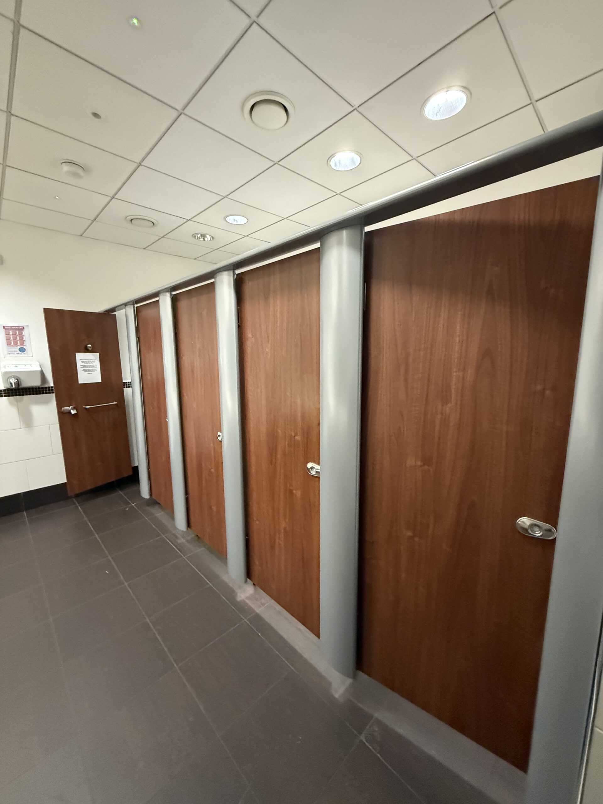
Woodgrain finishes
Woodgrains remain one of the strongest options because they bring warmth and familiarity into a space without the cost, lead time or practical limitations of replacing everything in real timber.
At the moment, black woodgrains, oak finishes and walnut tones are especially strong. They feel more current than the cooler grey woods that were more common a few years ago.
Woodgrains work particularly well on:
- doors
- architraves
- reception desks
- fitted joinery
- storage walls
- lift lobbies
- hospitality furniture and front-of-house surfaces
They are often the easiest way to introduce depth and material richness without overwhelming the space.
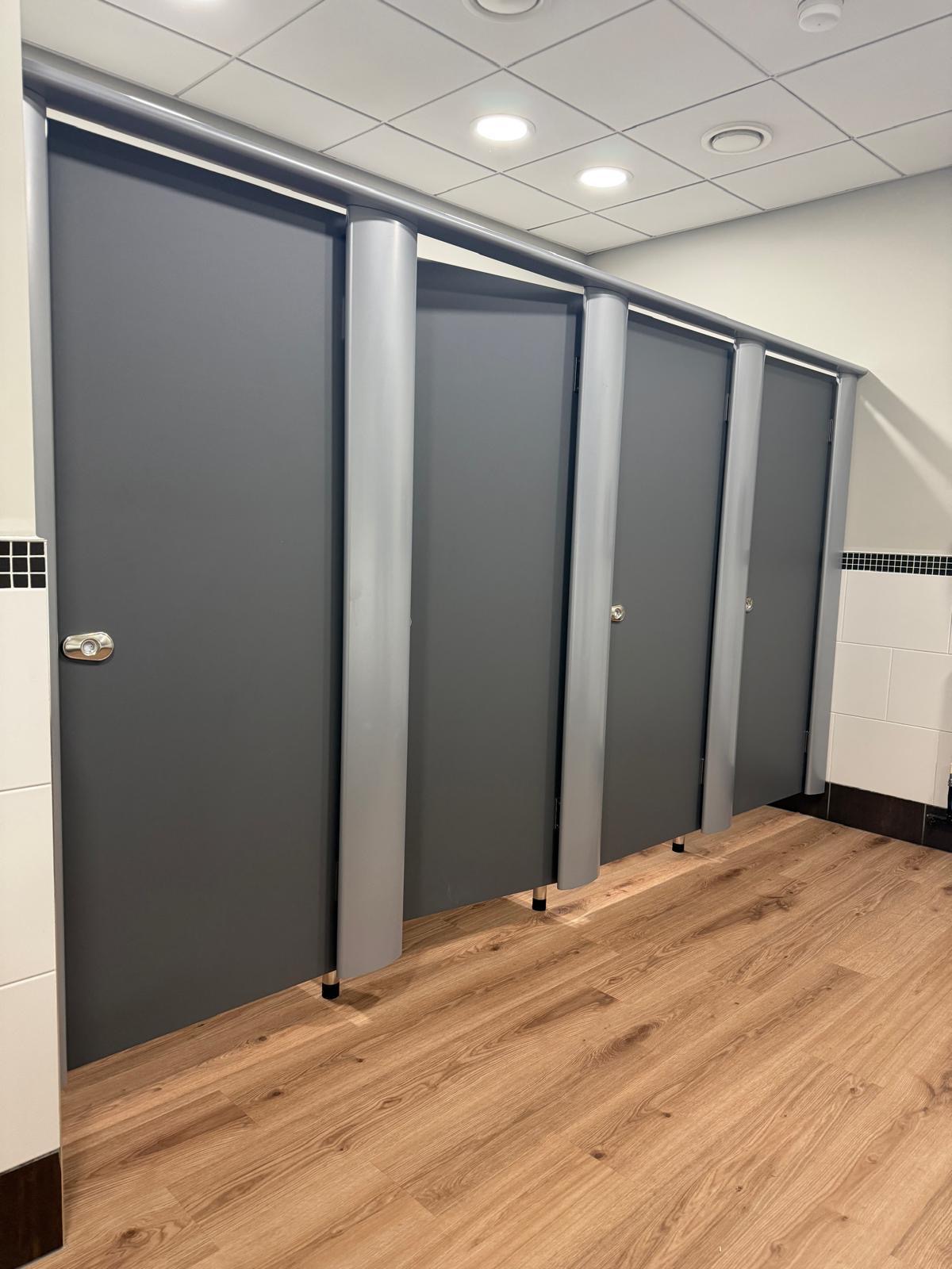
Solid colour finishes
Solid colours are useful when the scheme needs control and consistency.
They are especially effective where:
- the doors need to relate to painted elements
- the joinery has to sit quietly within a wider palette
- the designer wants a cleaner, flatter look
- a warmer neutral is needed rather than a timber effect
At the moment, beige solid colours are particularly useful because they sit well with warmer palettes and softer commercial interiors. They are also a strong way to tie doors, counters or vertical desk elements into surrounding finishes.
Metallic finishes
Metallics are most powerful when they are used with restraint.
Right now, bronze and brass are the most relevant directions. They add polish and a more hospitality-led feel, but they tend to work best as accents or on carefully chosen surfaces rather than everywhere at once.
They are often strongest on:
- bar fronts
- reception detailing
- trims and selected verticals
- feature counters
- small but high-impact surfaces
Used well, they can elevate a scheme quickly. Used badly, they can start to feel decorative rather than architectural.
Stone and concrete-effect finishes
Concrete-effect and stone-look finishes are particularly useful when the scheme needs more material weight.
They work well where you want something:
- calmer than a metallic
- more tactile than a flat solid colour
- more contemporary than a traditional timber
- and more premium than a basic laminate feel
At the moment, concrete-effect stone finishes are especially useful in offices and hospitality spaces where designers want a more muted, contemporary palette.
Specialist textured finishes
These are the finishes that often bring the most individuality to a scheme. They can be useful when the project needs more character, but they also need more judgement.
Textured finishes tend to work best when used in a focused way rather than across every surface.
Architectural film finishes compared
| Finish family | Best for | Visual character | Where it works best | Key thing to watch |
|---|---|---|---|---|
|
Woodgrains |
Warmth, material richness, softer commercial schemes |
Familiar, premium, grounding |
Doors, joinery, reception desks, hospitality interiors |
Undertones under site lighting |
|
Solid colours |
Control, simplicity, palette consistency |
Clean, quiet, contemporary |
Doors, frames, counters, vertical joinery |
Can feel flat if the colour is wrong for the lighting |
|
Metallics |
Accent impact and a more luxurious feel |
Reflective, sharper, more statement-led |
Reception features, bars, trims, selected counters |
Easy to overuse |
|
Stone / concrete effects |
Contemporary schemes with more depth |
Calm, tactile, architectural |
Worktops, counters, feature surfaces, tea points |
Needs to sit well with adjacent textures |
|
Specialist textures |
Character and individuality |
Varied, often more expressive |
Select feature areas, hospitality details, branded focal points |
Can feel trend-led if overapplied |
What is trending now
At the moment, some of the strongest directions are:
- black woodgrains
- oak finishes
- walnut tones
- beige solid colours
- concrete-effect stone finishes
- bronze and brass metallics
These are working well because they feel warmer, more material-led and more intentional than the cooler, more generic directions that dominated before.
Grey woods, in particular, feel less current now than richer timber tones or softer, warmer neutrals.
That does not mean they never work. It just means they are no longer the easiest answer.
Lighting changes everything
This is one of the biggest mistakes people make when selecting finishes.
A sample can look great in isolation and completely wrong once it is under the actual site lighting.
That is especially true with:
- darker woodgrains
- metallics
- warm neutrals
- stone and concrete-effect finishes
Natural light, LED temperature, shadows and surrounding materials all change how a finish reads. A black woodgrain can feel deep and premium in one office and flat or too heavy in another. A beige solid can feel warm and calm in one reception and washed out in another.
This is why finish selection should never happen purely from a desktop mood board. The material needs to be judged in context.
The finish has to suit the traffic, not just the mood board
Designers rightly focus on visual quality first, but high-traffic commercial interiors still need finishes that suit the real conditions of the space.
That is especially important on:
- doors
- counters
- reception fronts
- lift interiors
- hotel guest-facing joinery
- wellness and hospitality environments
A finish might be beautiful, but if it is going onto a heavily used office door or a busy reception desk, the specification still needs to reflect that. The finish has to work aesthetically and practically.
That does not mean sacrificing the concept. It means making sure the concept survives contact with the actual building.
Layering finishes properly
Some of the strongest schemes come from how finishes are combined, not just which single finish is chosen.
For example:
- a timber door and a solid-colour reception desk
- a stone-effect worktop with a beige vertical
- a bronze detail paired with darker joinery
- a matte neutral against a reeded glazing feature
This is where architectural film becomes especially useful. It allows designers to coordinate multiple surfaces much more closely than if they were stuck with whatever the existing materials happened to be.
That makes it easier to create rhythm across:
- doors
- frames
- counters
- desks
- wall-facing joinery
- transition points between spaces
Project at a glance: The Woodland Spa
At The Woodland Spa, the finish selection was part of creating a more premium and cohesive environment during a major expansion.
The scheme included wrapped lift surrounds, vanity units and IPS panels, showing how architectural film finishes can support a luxury hospitality feel without replacing those elements outright. This is a good example of finish specification doing more than just hiding wear. It actively shapes how the space feels.


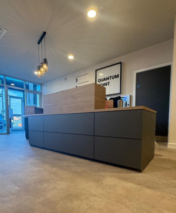
Project at a glance: Findel House
At Findel House, the finish relationship between surfaces is what made the scheme work.
The office reception desk used a solid grey finish on the vertical sections to tie in with the wrapped doors, while the horizontal surfaces used an oak finish. That kind of combination is a good reminder that the best finish choice is often not one finish applied everywhere. It is the right balance between finishes across the scheme.
This is exactly where designers get the most from architectural film. It gives them control over how surfaces relate to one another, rather than forcing the project to accept whatever is already there.
Common mistakes when choosing architectural film finishes
The most common mistakes are not usually about choosing the “wrong” category. They are about choosing too quickly.
Not thinking about lighting
A finish that works on a sample board can change dramatically once it is installed in the real space.
Not considering wear levels
A finish for a quiet feature panel is not the same as a finish for a heavily used door or counter.
Choosing in isolation
A finish might look great on its own but feel disconnected once it is placed next to flooring, paint, glazing and other joinery.
Following trends too blindly
Trends matter, but only if they still serve the scheme. A finish should not be selected just because it is current.
A better way to choose architectural film finishes
The strongest finish specifications usually come from asking a few straightforward questions:
- What is the overall mood of the space?
- Which surfaces are doing the most visual work?
- Which finishes need to feel quiet, and which need to stand out?
- How will the finish behave under the actual lighting?
- Does it suit the traffic and level of use?
- How does it relate to the rest of the scheme?
Those questions are much more useful than simply asking what is fashionable.
FAQs About Architectural Film Finishes
What are architectural film finishes?
Architectural film finishes are decorative surface finishes designed to replicate materials such as wood, metal, stone or solid painted colours on existing hard surfaces.
Which architectural film finishes are most popular right now?
Strong current directions include black woodgrains, oak finishes, walnut tones, beige solid colours, concrete-effect stone finishes and bronze or brass metallics.
Are grey wood finishes still popular?
They are less dominant than they were. Warmer timber tones and softer neutrals generally feel more current at the moment.
What is the biggest mistake when choosing a finish?
One of the biggest mistakes is judging a finish only from a sample in isolation, without considering the lighting and surrounding materials in the real space.
Should finish selection be based only on the mood board?
No. The finish still has to suit the traffic, use level and practical demands of the actual environment, not just the concept visuals.
Talk to Fusion About Architectural Film Finishes
If you are specifying a refurbishment scheme and want help choosing architectural film finishes that work visually and practically, Fusion Surfaces can help.
We work with designers, fit-out teams and commercial clients to select and install finishes across doors, counters, joinery, wall-facing surfaces and other hard interior elements, helping schemes feel more cohesive without full replacement.
Explore interior films we supply, view projects like The Woodland Spa and Findel House, or contact our team to discuss your project.

